
Wine Branding and Packaging.
The Outsiders
Life can be tough for everyone sometimes, especially if you’re an outsider. This self-initiated brief developed around the narratives of circus performers from the late 18th century, with an aim to create packaging for these characters’ favourite wines.

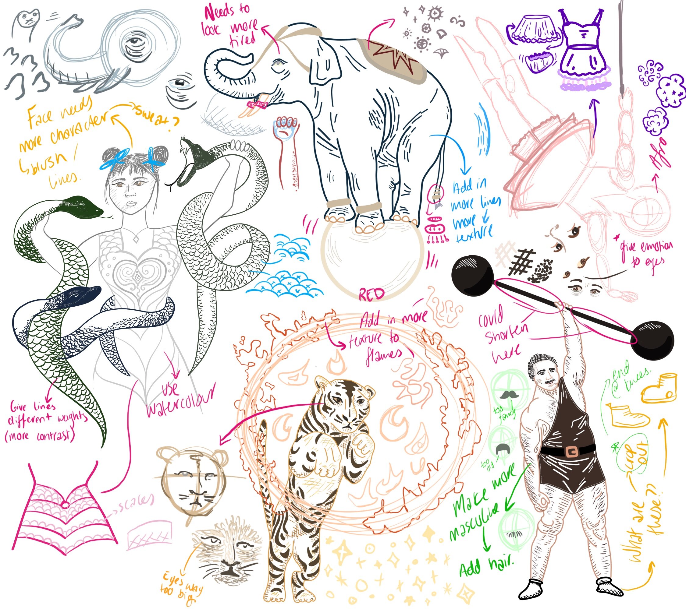


I created a wine label and accompanying illustration based around the story of each performer, conveying a unified appeal of exploration, mystery, and comradery.
The visual style is taken from the aesthetic of posters in the late 18th century, often created in watercolor as a cheap and effective means to deliver visual impact. The type also reflects this, while adding a touch of craftsmanship and consideration to the bottles. The reds will form a separate range, targeted towards a higher-class market. These people will appreciate the heritage of not only the wine but also the characters and will be happy to pay a little more for this product.